In today’s rapidly evolving digital landscape, applications are expected to deliver instant value, clarity, and usability. Users no longer tolerate cluttered interfaces or confusing navigation. They demand clean, intuitive experiences that provide meaningful insights in seconds.
This is where the core app dashboard becomes essential. Acting as the command center of an application, a well-crafted dashboard turns complex data into clear visual stories. With advanced tools such as FineBI, FineReport, and FineDataLink, organizations can design dashboards that are dynamic, interactive, and aligned with modern user expectations.
Understanding the Foundations of a Core App Dashboard
Defining Purpose and Business Objectives
Every effective dashboard begins with a clearly defined purpose. Whether tracking sales performance, monitoring operations, or analyzing marketing campaigns, the dashboard must address specific user needs.
Understanding what users want to see and why ensures the dashboard delivers value rather than information overload. When objectives are clearly outlined, developers can design layouts, widgets, and visualizations that directly support decision-making and long-term business goals.
Essential Elements of a High-Performing Core App Dashboard
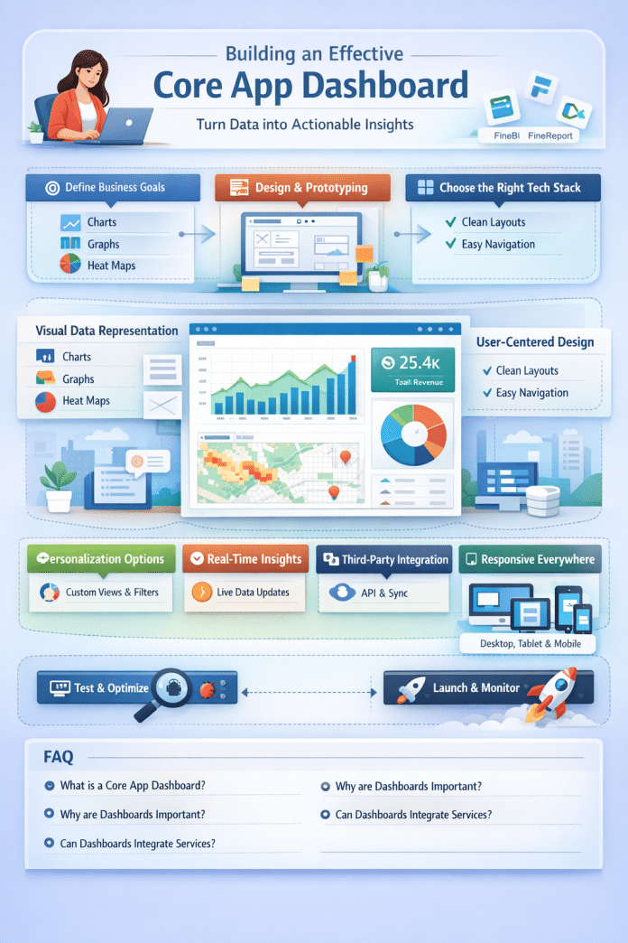
Visual Data Representation
Data visualization is the backbone of dashboard success. Charts, graphs, heat maps, and tables simplify complex datasets and make trends easier to recognize.
Advanced BI tools convert raw data into interactive visuals that enable users to explore insights, compare metrics, and identify opportunities with minimal effort.
User-Centered Interface Design
An intuitive interface ensures users can navigate effortlessly without technical expertise. Clean layouts, logical grouping, and minimal clicks create a smooth experience.
Low-code builders further simplify dashboard creation, allowing customization without heavy development work.
Choosing the Right Technology Stack
Frontend Frameworks
Modern frameworks like React, Angular, and Vue.js provide the flexibility needed to build responsive and visually engaging dashboards. The right choice depends on scalability requirements, performance goals, and development expertise.
Backend & Data Integration
Accurate and timely data is critical. A strong backend ensures reliable data processing, while integration tools unify multiple data sources into a single, reliable stream.
Robust integration eliminates silos and supports real-time insights.
Designing an Effective Dashboard Layout
Wireframing and Prototyping
Wireframes act as the structural blueprint of the dashboard. They define placement of KPIs, charts, and filters before development begins.
Prototyping tools like Figma and Adobe XD bring these concepts to life, allowing teams to test interactions and refine usability early.
Design Best Practices
- Maintain visual consistency
- Prioritize simplicity
- Use clear labels and legends
- Apply responsive design principles
Dashboards should perform equally well on desktops, tablets, and mobile devices.
Building the Core App Dashboard
Environment Setup
Install all required BI tools, integration platforms, and development frameworks. Configure databases, APIs, and version control systems to ensure a stable workflow.
Data Retrieval & Processing
Efficient data fetching ensures fast loading times and accurate reporting. Caching, indexing, and optimized queries help maintain performance.
Interactive Features
Add filters, drill-down options, and hover effects to empower users to explore data independently.
Testing and Quality Assurance
Functional Testing
Validate all components under different conditions and data volumes.
Debugging
Resolve issues promptly using debugging tools and logs. Final validation ensures a polished and reliable dashboard.
Enhancing Dashboards with Advanced Capabilities
Personalization Options
Users should be able to:
- Rearrange widgets
- Choose metrics
- Save views
- Apply filters
Customization boosts engagement and productivity.
Theme & Branding Controls
Allow users to switch themes, colors, and layouts to match brand identity or personal preference.
Third-Party Integrations
API connections enable dashboards to pull data from CRMs, marketing platforms, accounting systems, and cloud services creating a centralized analytics hub.
Advanced Visualization & Real-Time Updates
Interactive heat maps, dynamic graphs, and real-time refresh features transform dashboards into live monitoring tools for fast-paced decision-making.
Final Thoughts
A successful core app dashboard combines strategic planning, thoughtful design, and powerful technology. By defining clear goals, selecting the right tools, and continuously refining based on user feedback, businesses can create dashboards that deliver real impact.
Start experimenting with modern BI and reporting platforms, iterate often, and embrace innovation. Each improvement moves you closer to a smarter, more engaging, and more effective dashboard experience.
Frequently Asked Questions (FAQ)
What is a core app dashboard?
A centralized interface that displays key metrics and insights for quick decision-making.
Why are dashboards important?
They simplify data, improve visibility, and accelerate business actions.
What features should a dashboard include?
Visualizations, filters, real-time updates, customization, and integrations.
Can dashboards integrate third-party services?
Yes, through APIs and data connectors.
How do you keep dashboards user-friendly?
Use clean layouts, intuitive navigation, and consistent design patterns.

